
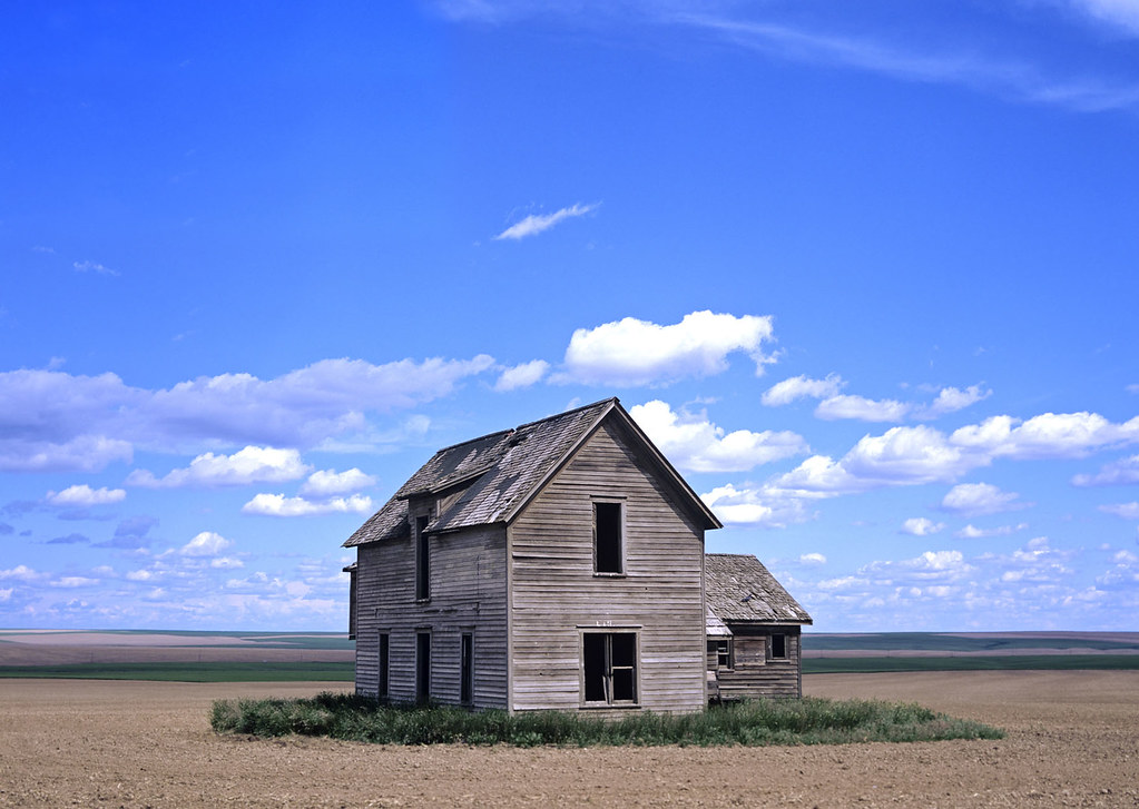
We're gonna be using Photoshop and 4 images to create a the below photo manipulation. We'll mainly focus on blending the colors and the contrast of the different images to get the final result, the most important step. Click the title to see the tut. You can click the image to view it larger.


For this tut, you'll need:
- Patience!
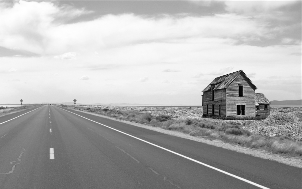
- The stocks: ROAD . GRASS FIELD . HOUSE . SKY
The road image was taken off by the original poster. I'm not sure if I'm allowed to repost it. Sorry for that.
As always, I strongly recommend that you try this yourself before going through this tutorial. Try and figure out how to do it. You just might discover that you don't even need this tutorial to begin with!
Also, read the entire tutorial before going through the steps and working.
I find this the best approach to working with tutorials.
STEP 1: BRING IN FIRST IMAGES
Create a new document. I'm using 1280 x 800 px. It's recommended you work at higher resolutions.
Go to File > Place and Import the ROAD image and resize it so that the left side of the road is only barely visible and we have some room on the right.

There'll be some empty space to the left. So we can transform (Edit > Free Transform) and fill in that space by pulling on the right placeholder.
Next, bring in the house image. Place the house then set the layer's opacity to about 50% and position the image so that it looks like it's sitting in the space on the right-side of the road:

It's best to ensure that the horizon of the road and the horizon of the house are aligned. This way the perspective will almost always look correct and it's way easier to figure out the correct scale to use. This isn't always the case, but it's a good starting point.
Okay, we need to cut the house from it's background. There's plenty of ways to do this; you can use the pen-tool or magic lasso. I prefer the Pen tool because you can create vector masks that are easy to edit later, but they tend to give hard edges.
So I draw my path around the house then go Layer > Vector Mask > Current Path.
This makes the path I just drew the mask:


You'll notice that I left some of the grass out. That's because of the next step:
STEP 2: ADD SOME GRASS
Okay, So I don't like the whole SWAMP look we have going on on the right side of the image, so I'm gonna use some grass from a field image.
Bring in the field image and have it BELOW the house layer in the layers pallet. Do this by selecting the "road" image before placing. New layers always go above the currently selected one.
Set opacity to 60% and Free Transform and position it. The horizons should line up. Notice where the horizon "really" is, as those trees in the back grow "above" it. It's not really important for this particular image, but it's good to remember.

So once it's lined up, set opacity back to 100%. This time we'll use a Layer Mask.
Go Layer > Layer Mask > Hide All.
This creates a new layer mask and hides the whole image. We're going to paint the grass back.
Hit B for the brush tool, the D to reset colors. Next, hit X to swap the colors. We need to paint white as white reveals the layer.
Before we begin, you'll notice that as we move away from the road there's some bushes before we hit the swamp-land. So, we're going to use this as our left edge.
When this is done, brush the grass back in. Remember the shrubs on the left. DON'T brush over them! :

Oh no! Looks like the tree-line is showing up.
To eliminate them, we can unlink the layer mask from the layer then grab the move tool and move the image up. This will move the image without moving the mask. I'll also free transform (Ctrl+T) and scale the grass down. The grass looks zoomed in, we need it to look small.


To eliminate them, we can unlink the layer mask from the layer then grab the move tool and move the image up. This will move the image without moving the mask. I'll also free transform (Ctrl+T) and scale the grass down. The grass looks zoomed in, we need it to look small.

So we're facing one HUGE problem, the grass is a whole other color and has different contrast, so we'll need to fix that.
STEP 3: Match Contrast
In order to match the contrast, we'll need to get rid of the color temporarily. Color tends to distract the eye.
Go to Layer > New Adjustment Layer > Hue/Saturation.
Set Saturation to -100 then head back to the Layers pallet and set the Blend Mode to Color. This ensures that it's only removing color and not adjusting anything else.
Now we're seeing the real contrast It looks like the house doesn't match any of the other images, and the grass looks much closer to the road's contrast than it appeared at first.
So, we'll start with matching the grass to the road, then we'll do the house.
Select the grass layer and go Layer > New Adjustment Layer > Levels.
Now, hold down ALT and click the line between the grass layer and the Levels adjustment layer. This clips the Levels, making it only happen within the grass layer. Essentially, we're only adjusting the grass layer with this.
Select the grass layer and go Layer > New Adjustment Layer > Levels.
Now, hold down ALT and click the line between the grass layer and the Levels adjustment layer. This clips the Levels, making it only happen within the grass layer. Essentially, we're only adjusting the grass layer with this.
Adjust the Levels until the grass matches a lot better:

Now, we need to match the house to everything else. Follow the same procedure as above:

While adjusting, I look at the overall image as well as the grass under the house.
Make very slight changes as you do this. We're using adjustment layers so we can always come back.
So far so good, we almost forgot something: The Sky.
Follow the same procedure for masking and matching contrast until you have this:

STEP 4: TRIMMING HERE AND THERE
Now that our contrast looks decent, we need to do some clean-up. We'll start by making sure the mountain on the far right is coming through.
Next, we'll use a layer mask to cleanup the edge between the house's grass and the new grass.
Select the house layer and go Layer > Vector Mask > Reveal All.
Press D to reset colors then using a big brush with 0% hardness, brush slightly outside of the grass' edge to make the transition A LOT softer. Make sure the softness of the brush doesn't hit the house's walls or it's going to break the illusion. After a few attempts, it looks like this:

Looks awesome!
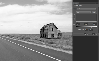
STEP 5: COLORS!
Great, everything looks nice, but now we need to fix the colors. Move in and adjust any of the levels layers as you see fit. I've played with my sky a little.
Okay, delete the Hue/Saturation adjustment layer.

OMG!!
Although our contrast matches, our colors are so off. So let's fix that.
Okay, delete the Hue/Saturation adjustment layer.

OMG!!
Although our contrast matches, our colors are so off. So let's fix that.
Select the Grass' Curves layer and create a new Hue/Saturation adjustment layer. Set this one's Blend Mode to Color as well. Don't forget to clip it.
Now we need to play with the controls until we get something that matches, once again, the shrubs on the left that we used as the edge serve as a good reference. Adjust the "Saturation" and "Hue" controls only.

Next, the house. We won't use a hue-sat as this one is just... a bit blue...
Select the adjustment above the house, change the channel to Blue then adjust the Black and Grey points slightly.

Okay, now the sky is out of sync. We'll do the same, adjust the "Blue" channel:

STEP 6: FIX A FEW PROBLEMS
First, let's clean-up our masks. Go in and fix any little issues you can find. Tweak your adjustment layers until everything matches everything better. If you don't see a need to change, don't.
Next, I don't like the brown strip of ground we have on the left side. It's distracting, I'd rather make it green.
We can do this a few ways, we could clone-stamp some grass. But I'd rather just change its color.
Create a Hue/Sat above the road layer. We'll keep blend mode at Normal.
Increase the saturation for a moment, then select the layer mask and hit Ctrl+I. This will hide everything.
Now grab a white brush and brush over the strips I don't like:


Adjust all the controls in the Hue/Sat until it looks like above! Now it's all nice and green.
I've also tweaked the "blue" channel in the Grass' Levels to make it less... yellow!
STEP 7: VIGNETTE AND GRADE
Okay, let's add a vignette.I've explained this a lot so I'll run through it:
Grab the Circle Marquee and draw a circle inside the frame, create a new black Solid Color layer. Select the layer mask and invert it then go Filter > Box Blur and blur it out a lot then lower the opacity of the layer.

Next, create another Black Solid color. Set opacity to 40%. Grab the Gradient tool and draw a gradient from the top to just about half way. This creates a dark-look at the top to keep focus on the centre of the image.
Feel free to add any other adjustments or make modifications to this project. Take a look at the histogram and see what you can adjust.

CONCLUSION
We've created a manipulation merging 4 images and also practiced matching contrast and colors of each of the images in order to keep everything as uniform as possible.